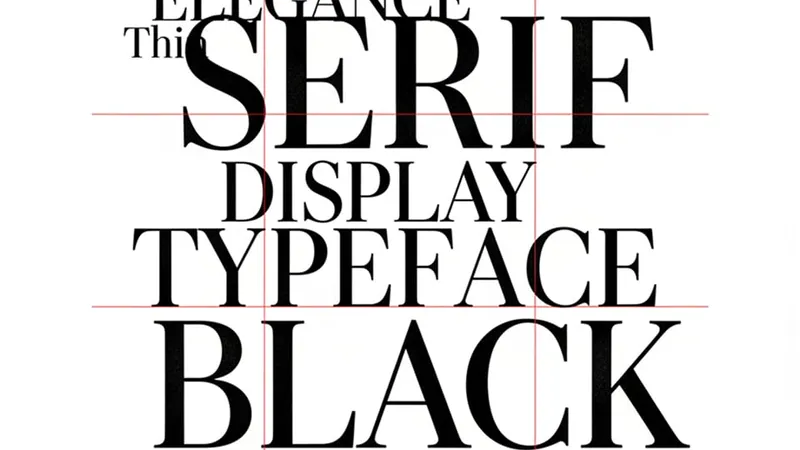
A type scale looks best in the place it was designed: a wide artboard, at 100% zoom, on a colour- managed display, with one paragraph of text on it. Almost none of those conditions hold when somebody actually reads the thing.
The artboard lies about size
Design tools measure text boxes, not typefaces. A heading set at 72px in Figma will occupy a noticeably different width once a real webfont renders it with real hinting and real letter-spacing — in this project’s own type stack, consistently around ten percent wider.
Which means porting a box width from the mock is porting a measurement of the wrong thing. Set the
real string in the browser, look at where it breaks, and let the content decide the measure.
text-balance and a max-width will get you the line break the designer drew, and they’ll keep
getting it when the copy changes.
Hierarchy is contrast, not size
The instinct when a heading isn’t landing is to make it bigger. Usually the problem is that it isn’t different enough — same weight, same colour, same family as the paragraph beneath it, just larger.
Editorial hierarchy has always come from contrast on several axes at once: a serif display face against a sans body, a light weight against a normal one, near-white against a mid grey. Change two of those and you can often make the heading smaller and have it read as more important.
This matters more, not less, on a small screen, where the size axis is the one you have least of.
Design the fallback, don’t inherit it
Fluid type with clamp() is the right default, but an unattended clamp() between two good values
produces a lot of bad ones in the middle. The 900px viewport nobody tested is where a display
heading lands at an awkward size that’s too big for the column and too small to feel deliberate.
Check the ends and the middle. Three viewport widths per scale step is enough to catch it, and it takes a minute.
Low resolution is still the common case
A great deal of reading happens on cheap panels at less-than-ideal brightness, where thin weights disappear and low-contrast greys go to mud. The muted colour that reads as elegant restraint on a calibrated display can be genuinely illegible on a laptop at half brightness in daylight.
Two habits fix most of it: never carry body copy below 400 weight, and check contrast against the actual background token in both themes rather than against the white you designed on. Restraint that can’t be read isn’t restraint. It’s just missing text.