Ardent Type
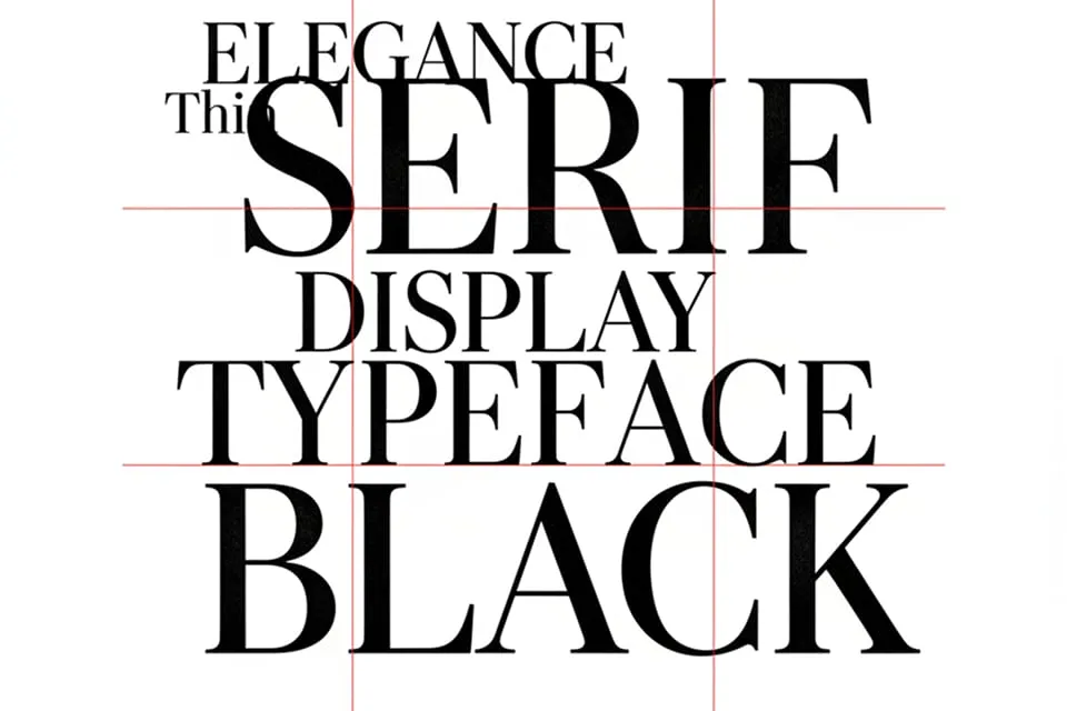
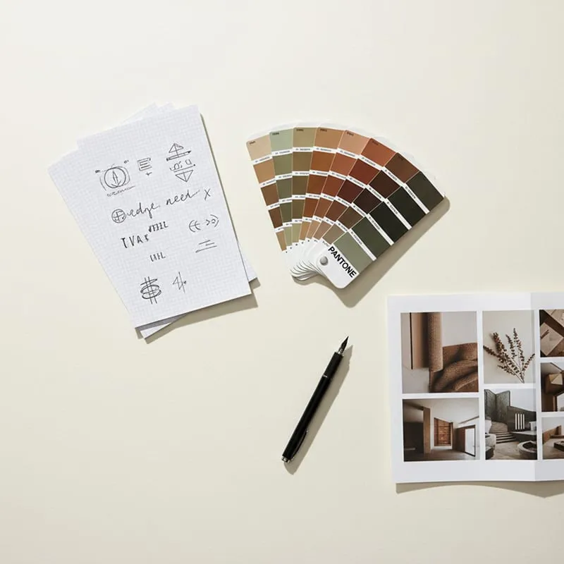
Ardent Type is an independent foundry releasing two or three faces a year, each cut with an opinion. The brief was an identity that could sit beside any of them without competing — a frame quiet enough to let the type itself do the talking.
- Client
- Ardent Type
- Year
- 2025
- Stack
- Glyphs, Figma
- Role
- Type Design, Identity
An identity built to step aside
The wordmark is set in whatever face the foundry released last, so the brand renews itself with the catalogue. Everything around it — a mono label system and one accent rule — stays fixed, which is what makes the rotation legible.

Specimens as the interface
The site treats every page as a live specimen. Sliders for size, weight and tracking write straight into the text you are reading, so evaluating a face and browsing the site become the same gesture.
Licensing without the fine print
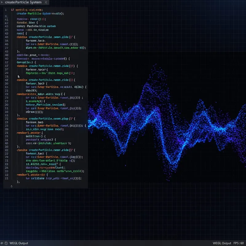
We rebuilt the licence flow as a single plain-language page: pick a tier, see the exact wording, pay. Checkout drop-off fell by a third once the PDF maze was gone.
What clients say
“Working with this studio was a transformative experience. They didn't just design a logo; they codified our future.”
Arthur Sterling
Managing Director, Meridian Capital