Northwind Coffee
Northwind is a small-batch roaster on the Norwegian coast, selling single origins to people who mostly buy on the label. The brief was to trade the sector's kraft-paper clichés for something with the clarity of a shipping manifest and the warmth of the café itself.
- Client
- Northwind Coffee
- Year
- 2025
- Stack
- Figma, Blender
- Role
- Brand Identity, Packaging
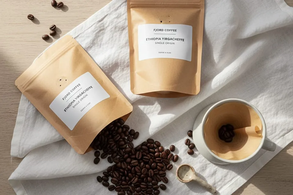
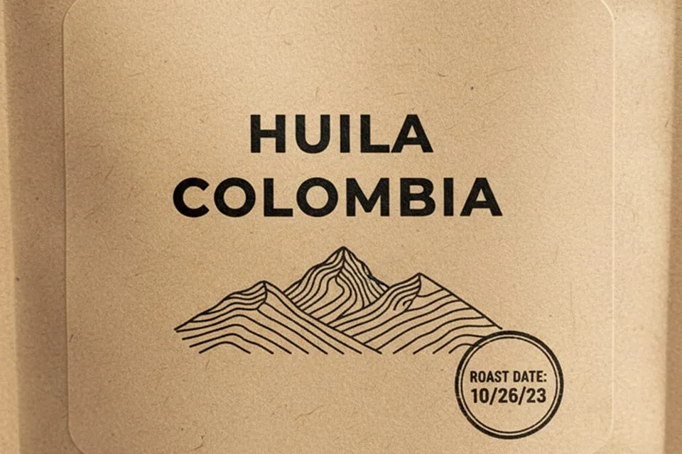
A label system that tells the origin's story
Each origin gets a colour field and a set of coordinates rather than an illustration. The grid holds every roast to the same layout, so a shelf of Northwind bags reads as one voice describing different places.
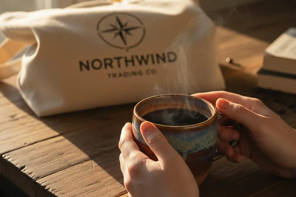
Packaging that survives the counter
The bags were designed at arm's length, not in a lightbox: type sizes were set from legibility tests at two metres, and the resealable face keeps the origin block visible after the first pour.
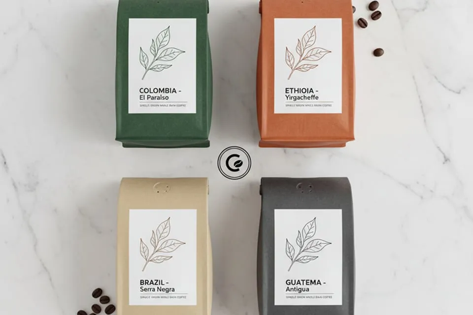
One system from bag to browser
The webshop reuses the label grid as its product template, so a bag's face and its product page are the same composition. Photography stays documentary — beans, water, steel — and the colour fields do the branding.
What clients say
“Working with this studio was a transformative experience. They didn't just design a logo; they codified our future.”
Arthur Sterling
Managing Director, Meridian Capital